Should your brand fonts be used in your website design?
5 min read

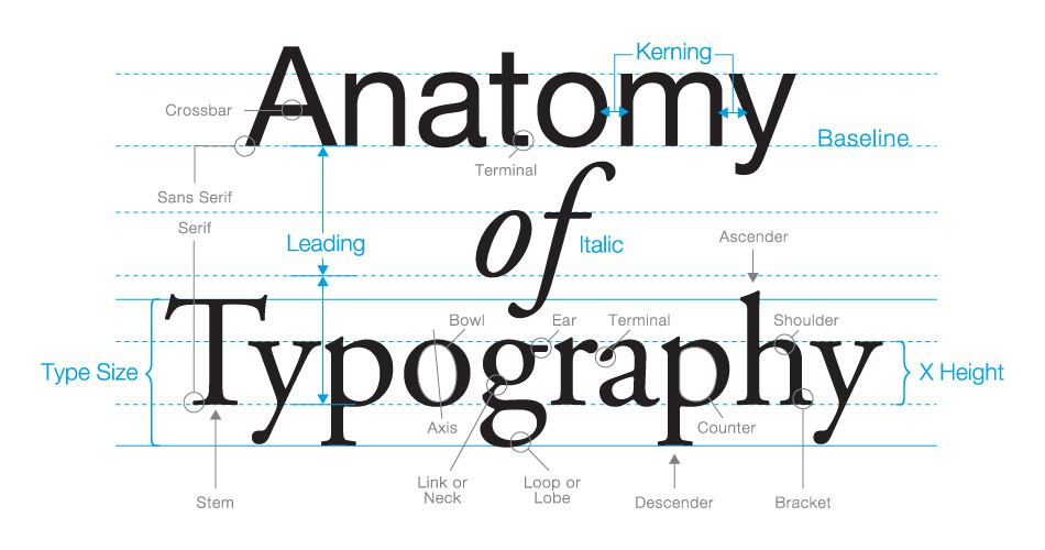
Yes of course, but only if they’re accessible. Many of today’s most common fonts were designed last century for use in print, but some fonts are much easier to read in big paragraphs of copy, some more suited for headlines and titles, and some more suited to digital than print and vice versa.

Brand guideline fonts
Brand ambassadors have for years specified Arial, Helvetica, Verdana and Georgia within guides for use in body copy, but these may not actually be the most suitable fonts for all purposes. We often use guidelines which have been developed years ago by print designers hoping to present the same brand across all channels, without fundamental digital knowledge which should consider performance, accessibility and the practicality.
Typographically the web was always quite boring, with designers having to ask developers which fonts could be used, specifically which fonts were available on users systems.
Web safe fonts
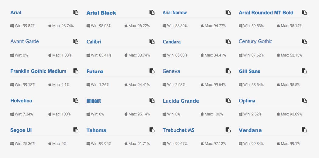
This is an often miss-used phrase which relates to an ancient system. In the early days of the web, it was important to choose a font which was already installed as default on the machine viewing the site. So previously web safe fonts referred to a selection of fonts which were knowingly installed on most Windows and Mac systems, these include:
- Arial – which was designed in 1982 and became the de facto standard and is one of the most widely used sans-serif fonts still used today, on and offline.
- Helvetica – is the designers’ go-to sans serif font and was designed in 1957 by Swiss typeface designer Max Miedinger.
- Times New Roman – is a serif typeface designed for legibility in body text, commissioned by The Times in 1931.
- Courier – is a monospaced slab serif typeface, designed to resemble the output from a typewriter and was originally designed by Howard “Bud” Kettler in 1955.
- Verdana – is known for its simple sans serif lines and it’s super large size. The letters are almost elongated, which makes it easy to read. It was released by Microsoft around 1996.
- Georgia – is another Microsoft font which was designed in 1993 and released in 1996.
- Palatino – dates back to the Renaissance, being designed by Hermann Zapf and released in 1949.
- Garamond – the current version was released in 1990, however, the first Roman types designed by Claude Garamond were a set created for Robert Estienne and first used by him around 1530.
- Bookman – maintains legibility (or readability) even when used in a small size and was created by Alexander Phemister around 1858.
- Trebuchet – a medieval-themed font originally designed by Microsoft in 1994.

Thankfully for web designers and for users, online typography is an area of consistent improvement with a myriad options for using customised fonts online.
Custom font history
There has been a great deal of effort over the years to improve typography online, here are a few which have contributed significantly to making it possible to use non-standard fonts in website designs.
- Flash made it possible to use custom fonts on websites since its release in 1996, but wasn’t a search-engine friendly or accessible solution, and its decline started around 2010 when Apple stopped shipping products with it installed and disabled support on iOS devices.
- sIFR (or Scalable Inman Flash Replacement) was released in 2005 and made it possible to insert rich typography into web pages without sacrificing accessibility, search engine friendliness, or markup semantics. It was an open source JavaScript and Adobe Flash dynamic web fonts implementation, enabling the replacement of text elements on HTML web pages with Flash equivalents.
- FLIR (or Facelift Image Replacement) is similar to sIFR, but instead of using flash, it embeds plain images, that are generated automatically from the text on the webpage. FLIR was even less accessible than sIFR.
- Cufón was a font-replacement technique that used javascript and vector graphics to write fonts from a font file. It was a common but very poor method for loading custom font resources in to web environments. Originally launched in 2008, it was discontinued in 2017.
- Typotheque was the first type foundry to introduce the concept of webfonts in October 2009.
- Fontdeck was founded in 2009 and provided customised fonts to websites, but closed down in December 2016.
Custom font solutions
Today we have hundreds of new fonts available to use online, which are both highly accessible and search-engine friendly. There are still some minor technical and performance considerations, and we don’t have 100% compatibility with all devices and browsers, but today we can have a really rich online typographic experience, made possible by two major players:
- Abobe Fonts (previously Typekit) is an online service which offers a subscription library of fonts which may be used directly on websites, or synced via Adobe Creative Cloud to your applications. Typekit was launched in November 2009 and acquired by Adobe in October 2011 before changing its name to Adobe Fonts in October 2018.
- Google Fonts (previously called Google Web Fonts) launched in 2010 and now has a library of 900 libre licensed fonts, an interactive web directory for browsing the library, and APIs for conveniently using the fonts in our website designs.
Web and mobile fonts
Legibility, readability and accessibility are all essential aspects of web and mobile typography of today, which has led to the release of specific web and screen optimised fonts.
- Open Sans is a sans-serif typeface designed by Steve Matteson and commissioned by Google in 2010. It was developed with an “upright stress, open forms and a neutral, yet friendly appearance” and is “optimized for legibility across print, web, and mobile interfaces.
- Source Sans Pro is Adobe’s first open source typeface family, designed by Paul D. Hunt in 2012. It is a sans serif typeface intended to work well in user interfaces.
- Roboto is a neo-grotesque sans-serif typeface family developed by Google as the system font for its mobile operating system Android. It was officially made available for free download on January 12, 2012.
- Lato is a sans serif typeface family started in the summer of 2010 by Warsaw-based designer Łukasz Dziedzic (“Lato” means “Summer” in Polish). In December 2010 the Lato family was published under the Open Font License by his foundry tyPoland, with support from Google.
- Montserrat is a “libre sans text typeface for the web, inspired by the signage found in a historical neighborhood of Buenos Aires” designed by Julieta Ulanovsky in 2011 thanks to a successful Kickstarter campaign.
Get in touch
We’d be happy to discuss your online branding and website accessibility.
Further reading:
- Read this article “Everything You Need to Know About Picking Brand Fonts” to help choose the right font for your organisation
- https://www.designersinsights.com/designer-resources/anatomy-of-typography/
- https://www.cssfontstack.com/
- https://typography.guru
- https://www.awwwards.com/20-best-web-fonts-from-google-web-fonts-and-font-face.html
- https://www.typotheque.com/fonts/on_screen_reading
- https://medium.com/productivity-revolution/10-best-fonts-for-improving-reading-experience-6171ce199e97
