Guide for creating a successful charity website
11 min read

Success in digital is intertwined with the success of the website. So how do you create a successful charity website?
Latest insights from the Charity Digital Skills Report shows 45% of charities still don’t have a digital strategy. Despite this fact, 72% believe investing in digital would help them increase fundraising.
We outline seven key elements required to create a successful charity website.
- Identify your users and their objectives
- Customer Digital Experience
- Setting Your Objectives
- Website Budgets
- The CMS system
- CRM integration
- Donation Funnel
Find out how we can help with your charity website
1. Identify your users and their objectives

“I believe that most websites suck because Hippo’s create them. Hippo is an acronym for the highest-paid person’s opinion!” – Avinash Kaushik
Designing a website is always a bit of a balancing act, ‘What does success look like for you?’ and ‘What does success look like for your website visitors?’
The two main benefits of conducting user research are:
1. It provides evidence and justification for strategy and design decisions.
2. It saves you time and money over the long term by helping focus your digital activity on the issues of most importance to users.
Charity websites are different from many business websites in that they often have a larger number of different users, all with different needs. Knowing your users and recognising their goals will help to maximise the success of a new website.
There are many ways to build an understanding of your users and their expectations including:
- Internal discussions: From internal discussions and based on your own experience and insight on sector trends, you can normally draft a pretty good list of user groups to frame your discussions.
- External discussions: You can build a focus group of users, either from your existing website visitors if you are hoping to serve them better, or from sources outside the website if you are planning to extend the reach of your organisation.
- Data Insights: If there is an existing website, you can often look at statistics about users (geographic, pages views, devices and demographics). It’s important to understand that statistics can only tell you who is looking at the website now, not the hidden potential audience that a new project might be designed to reach.
The process will help enable you to create Personas.
Personas
A buyer persona is a semi-fictional representation of your ideal customer based on market research and real data about your existing customers.
“It’s hard to overstate the importance of creating buyer personas. “Whether your organization is engaged in B2B, B2C, or non-profit marketing makes little difference. Why? Because the creation of buyer personas should inform everything you do as a business owner or inbound marketing professional.” – Bob Ruffolo. Bob goes into greater detail on why you need to create buyer personas
Keep in mind, buyer personas should be evaluated and reviewed regularly. This helps ensure everyone at you non-profit organisation fully understands your personas and that they’ll continue to align website projects against them.
2. Customer Experience – Mapping the customer journey
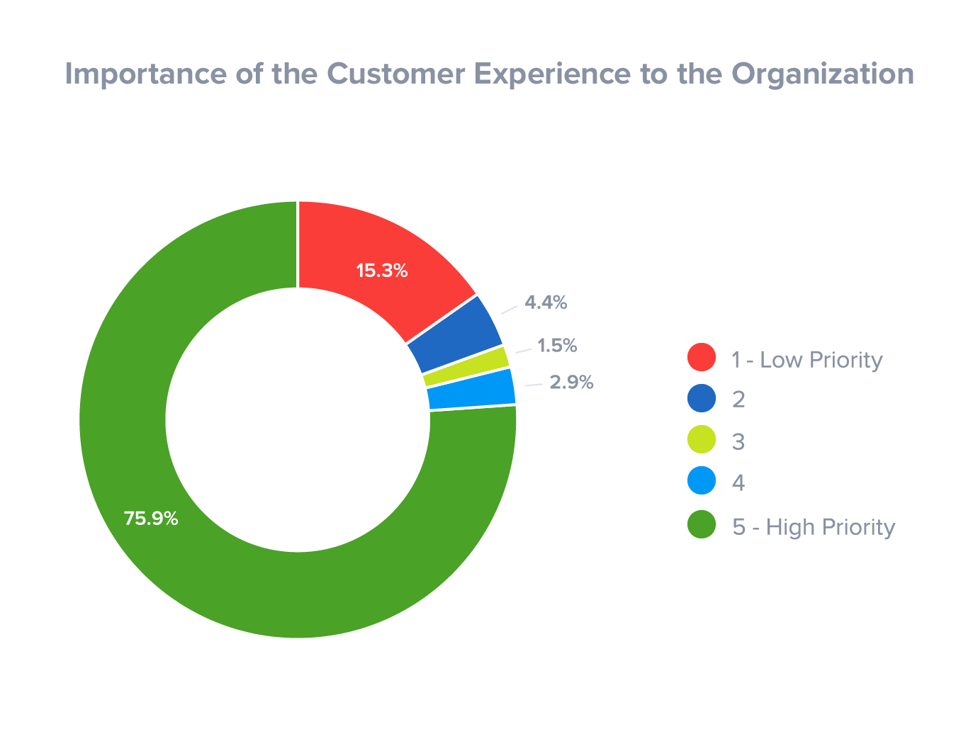
Customer-centric practices have been one of the key considerations in this age of digital transformation. A survey by Bloomberg Businessweek found that “delivering a great customer experience” has become a top strategic objective. And a recent Customer Management IQ survey found that 75% of customer management executives and leaders rated customer experience a ‘5’ on a scale of 1-5 (5 being of the highest importance).
Digital customer experience must be considered, it can make or break website success. Digital customer experience is through an interface, like a computer, tablet, or smartphone.
Karnaukh highlights “Having a good digital experience, i.e. the website that communicates the brand message, directly addresses users’ needs and triggers the right emotions, is a starting point in the digital journey for any brand,”. As a result, organisations should see digital experience as a complex and compound thing that is built up by a multitude of elements based on the audience analysis – from the website look and feel, including the colour scheme, patterns and content organisation; to properly worded texts that would be written in the language your users speak.
Please get in touch to discuss your charity website project
Website journey mapping
So how can you begin to plan and improve your customer digital experience? Website Journey mapping is one way. It enables you to see your organisation from the supporter’s point of view and help support your charity in understanding their needs, experiences and emotions.
With customer journey mapping the aim is to ultimately understand the customer’s view of your charity and to identify improvements based on customer insight, which could range from quick wins, process changes and technology enhancements. One way to gather supporter needs is gaining insight through ‘I want’ statements. These are the supporter goals through the website journey that can help your charity really focus on providing a great experience for website users.
“Customer journey mapping may not give you all the answers but it will help you ask the right questions.”
Don’t see customer journey mapping as the end goal, it’s a tool, a doorway, a broker of change. Customer journeys may not give you all the answers but they will help you ask the right questions. See customer journey mapping as a tool in your customer experience toolkit, and don’t forget it mostly comes down to how you use the tool rather than the tool itself, that will make it a success.
3. Setting your objective
Websites often have to do numerous tasks but putting too much information in one place can overwhelm your audience and make your message unclear. Prioritising what you want your website to say can make sure this doesn’t happen.
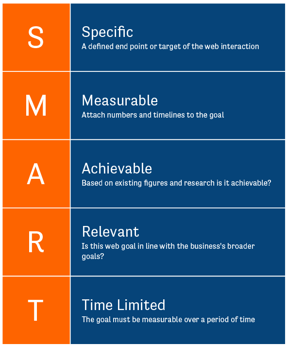
Not for profits organisations will (hopefully) have mission statements detailing overriding objectives for what the charity is trying to achieve in the next 1, 3, 5 or more years. The aim is to use the organisation objectives and set ‘measurable’ website goals via SMART targets.
SMART targets are…..
For example: To reduce the number of enquiries received by phone by 30% in six months.
Once you understand what you expect your website to accomplish specifically you can begin to design/tweak the website to improve performance. Using the example given, if visitors are struggling to find information that is buried away on your website they might choose to phone your enquiry line which can put pressure on resources. Hence you could review the website structure and content to measure the impact.
4. What is your budget?
Budget is always a sensitive subject. There aren’t many things that vary in price as much as a charity or nonprofit website, which can easily range from £500 to £100,000. This makes it very difficult for you to know how much to budget for your website and whether any particular website agency or provider is offering good value for money.
Think about when you buy a car. Without specifying your budget it’s going to be trickier for a car dealer to know what to suggest. A £700 car will be wildly different from a £10,000 car: Both cars would get you from A-B but offer you an experience that is worlds apart. Making your budget available alongside what you need your site to do will allow a web company to provide you with an accurate quote and give you a good idea of what you can get for your money. This will, in turn, help you to prioritise what functionality you desperately need and help you to understand ROI.
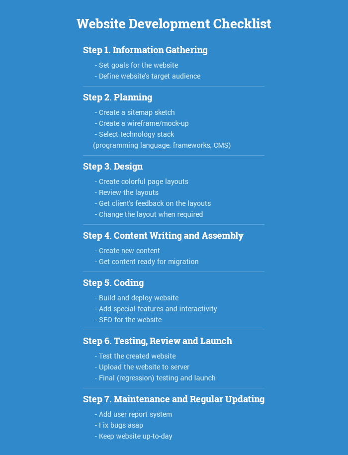
Stages of developing a website
You should always keep in mind that a website development project doesn’t start with coding and doesn’t end after the day you finally launch your website.
5. Easy to use website content management system
Nearly all websites now require a content management system. Your charity will need to think about what specific features you require from a CMS. Look at your current website CMS system, what works well currently? What doesn’t? You’ll also want to think about how many people will require access to the systems and whether you’ll need different permission levels. This level of detail identified early on will help keep you on budget.
At Granite 5 we normally recommend a bespoke WordPress CMS. WordPress is the world’s most popular CMS so of its features include:
- Easy management: WordPress does not require PHP nor HTML knowledge, unlike Drupal, Joomla or Typo3. Making daily website management easier for the user.
- Community: To have useful support, there must be a large community of users, who will be a part of e.g. a discussion board.
- Quicker development: A bespoke WordPress website can be very quick and easy to build, especially for a simple offer or smaller business.
- Easily Integrated With Any Service/Application: Default WordPress has a lot of inbuilt functionality but you can even make it more powerful with plugins.
- It’s Getting Exponentially Better: Being the large and most effective community, WordPress is evolving day by day to improve its user-friendly interface and features. Over time, WordPress enhances its system every time with the latest version.
6. Integration with CRM
Every organisation including charities needs a CRM (C… Relationship Management) system, no matter how large or small that organisation is. Whether the C stands for Customers, Clients, Contributors or other Contacts, organisations need to manage their contacts and keep track of their interactions with them.
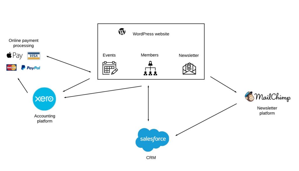
TIP – If you don’t have a CRM. Salesforce Power of Us program gives Nonprofit organisations and educational institutions access to Salesforce products and resources to help expand their collective impact. The Power of Us Program includes 10 donated subscriptions and deep discounts on additional subscriptions, products and/or services from Salesforce. More than 32,000 nonprofits around the world access Salesforce via the Power of Us Program.
However, a CRM is only as good as the data it receives. Many organisations fail to integrate their website with their CRM, and never realise the benefits they could receive by doing so.
- Better User Experience: Users are not disoriented by having to move between different interfaces to donate or register for an event, which often decreases completion rates. An integrated configuration means users always stay within the website.
- Automation: Automated responses, reminders and confirmations save staff time
- Consolidation: All organizational contacts and interactions are stored in one place, reducing the time required to assemble a mailing list or find someone’s contact information. All inquiries, donations, or other interactions through the website are automatically recorded in the CRM system.
- Real-Time Data Accuracy: De-duplication rules in the database avoid duplicate records and ensure accurate counts of donors, participants, event attendees, partners, media contacts or other relevant groups. Because any website inquiries or interactions immediately update the CRM system, your contact info is always up-to-date, in real-time.
- Communication: Any group of contacts can be messaged quickly by email. Phone calls can be documented and scheduled. Print mailing labels or a list of phone numbers are generated at the click of a button.
- Continuity: When a staff member moves on, their contacts and history of interaction remain with the organisation and new staff can easily pick up where old staff left off.
- Ease of use: Staff only needs to log in to one system to manage both the website and the CRM system.
- Efficiency: Staff efficiency is boosted by automating procedures, eliminating the duplication of effort that comes with maintaining multiple platforms, keeping various contact lists up-to-date, and matching reporting between different systems.
7. A slick donation funnel
Fundraising is a different game from a few years ago. UK fundraising reports that “17% of online donations were made on a mobile device in 2016 versus 14% in 2015″.
With funding revealed as the biggest barrier holding charities back, there is more emphasis to buy in digital to help reduce this barrier.
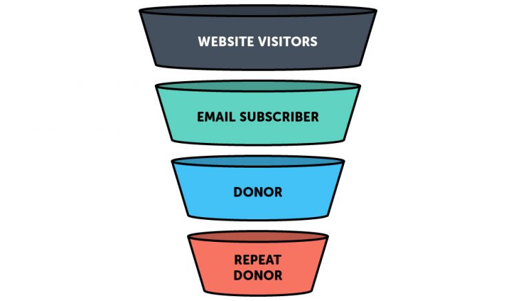
There are two ways to view the “donation funnel”. One is the marketing funnel which in practice, is a series of traffic sources, landing pages, and emails that work together to:
1. Capture interest – Once someone is interested in your cause, capture it.
2. Nurture interest – Build arousal through personalized and responsive email messages.
3. Convert interest – Maximize giving at the right moment.
4. Partner – Turn new supporters into spokespeople. Some are added to the development funnel.
Once a user has been engaged they are much more likely to convert into a paid supporter of your cause as they not only understand the need for their donation but also have a genuine relationship with the brand that further extends their empathy for the cause.
Website Donation Funnel
However, we should focus on improving the website donation funnel. Using some of these tactics the NSPCC saw a 28% rise in monthly donations conversion rate with an improved online giving platform.
- Emphasise your fundraising call to action: Your CTA should stand out to your donor audience like a lighthouse guiding them home. Choose a prominent position for it (such as your website header or main navigation) and make sure it is easily accessible from every page on your site. Remember, users might not always be accessing the site from your homepage, and you want to make your donation page easy to reach for all users.
- Focused Messaging: Keep your message simple and personal. Once focused on a specific group of potential donors, it’s so much easier to decide which message has the most potential to engage them.
- Page loading speed: A one-second delay in page response can result in a 7% reduction in conversions. Make sure to test and optimise your page speed
- Simple Forms: Keep the number of clicks to and fields within the donation form to a minimum.
- Mobile-Friendly: Make sure to have a responsive (mobile-friendly) website. With mobile search overtaking desktop in May last year, it is more important than ever to make sure that your website is adapted to different devices, thus allowing potential donors to donate on their preferred device.
- Multiple Payment methods: add in payment technologies including ApplePay, Braintree and PayPal to make donating easier and more convenient.
- Suggested donations: Keep suggested donations realistic (but not too low). This refers to a suggested amount that is automatically displayed on your donation page and is the ‘default’ amount to be donated. The actual amount will vary greatly depending on the charity, cause, and especially your donor segment.
- Repeat donations: Thank your donors, show appreciation and encourage recurring donations. Your donors are taking the time and effort to help your organisation, this deserves a kind word! Make it easy for them to donate and find a way to show your appreciation (a personalised message or thank you email for example). Consider creating simple options for automatically recurring monthly or yearly donations, whose renewal doesn’t require any effort on the part of the user.
Final thought – promotion
Finally and ultimately the success of a website will rest on the digital promotion of the website. Marketing a charity website is a massive subject which we will cover in a future post. However, we will call out a few FREE or discounted resources and tools that will help online exposure.
Free AdWords For Charities
Through this program charities and non-profit organisations can get up to $10,000 (around £6,000) of free AdWords advertising every month. With Google now claiming to process over 40,000 search queries every second your charity and its causes can be exposed to many thousands of potential donors every day with the benefits of this exposure being limitless.
YouTube Non-profit Programme
The YouTube for Non-profit Programme gives non-profits access to unique YouTube features to help them connect with supporters, volunteers and donors.
Hootsuite
Hootsuite is a social media management tool, which allows you to manage your social media accounts all in one place. Hootsuite offers nonprofits a 50% discount off their Professional and Team plans.
Mailchimp
The email marketing tool, Mailchimp, offers an easy way to create mobile-optimized emails and email newsletters for your supporters, donors and beneficiaries. Their Forever Free plan is perfect for small nonprofits as it allows you to send emails to up to 12,000 people per month and have up to 2,000 subscribers. If your nonprofit is larger and has a much bigger email subscriber list then Mailchimp offers a 15% discount to charities.
Workplace by Facebook
Does your nonprofit struggle with internal communications? Workplace by Facebook is designed to work as a social platform for organizations, where they can collaborate on projects and turn ideas into action.
We love helping charitable organisations to make the most of their websites, through meticulously planning every detail, especially around the donation funnel and any points of conversion. If you would like more advice feel free to contact Granite 5 on hello@granite5.com or call us on 01223 208008.
