Mobile responsive websites no longer optional!
3 min read

The age of mobile search is maturing rapidly. Google has in the last few weeks released two more updates that indicate mobile usability signals will soon have a direct impact on your rankings.
It’s nothing new to say that Google prefers websites that has been configured for mobiles. In fact, Google have gone on record to say –
| Responsive design: serves the same HTML for one URL and uses CSS media queries to determine how the content is rendered on the client side. This removes the possible glitches of user-agent detection and frees users from redirects. This is Google’s recommended configuration.
Webmaster tools update: Mobile usability added
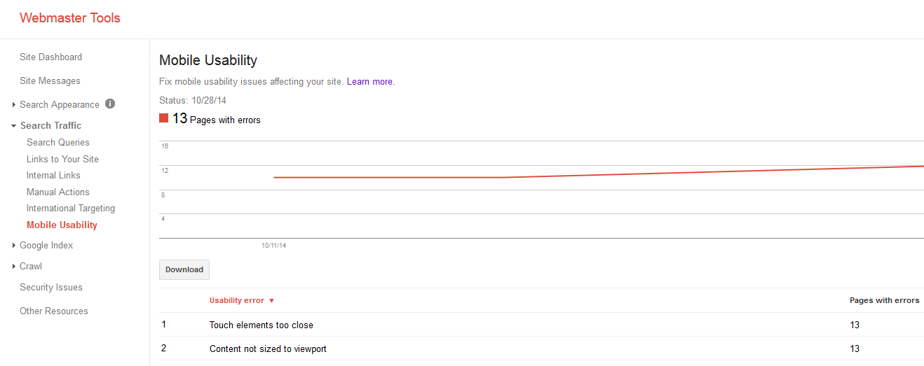
Last week Google announced a new mobile usability report. This feature, on the Google Webmaster Tools platform, shows you common usability issues for mobile users on your website. The report is broken down into 6 sections then and provides a breakdown of “mobile responsiveness” for every individual URL on your website.
Currently, the six areas specified as important are:
1. Flash Usage
Flash animation cannot be shown on mobile devices, hence using flash on your website can lead to a poor user experience on mobiles.
2. Viewpoint not configured
Configuring the viewpoint, this tells browsers to adjust page dimensions to suit that of the device accessing the website.
3. Fixed-width viewpoint
Developers often configure sites to fit common mobile screen sizes, instead of adopting a responsive design.
4. Content not sized to viewpoint
This is where the stylesheet (CSS) of a site is configured to look best on desktop browsers resulting in a mobile user being required to scroll horizontally in order to see all of the website content.
5. Small font size
As it says, the font is too small for users to be able to read on mobile devices, resulting in lots of pinching and zooming from the user in order to read the text.
6. Touch element too close
As it says on the tin, the buttons and navigation links are too close together, resulting in accidental clicks.
You can find the new mobile usability report under the search traffic subheading. The report will look like the screenshot below.

Mobile friendly icons
In addition, Google has recently been experimenting with various icons that mobile users might see in their mobile search results. This is where mobile smartphone icons are being used to symbolize whether or not a web page is mobile friendly or not. At this current moment, it is unknown which version will be rolled out permanently.

These latest updates are part of an ongoing process from Google to make sure their users get the very best experience from their mobile search. Taken together they highlight the importance of configuring your website for mobile and smartphone users.
Google has been testing a new ‘Mobile-friendly’ label that will be included within the mobile search results for all sites that qualify for it. To find out if your site qualifies for the ‘Mobile-friendly’ label use Google’s new Mobile-Friendly Test. The tool quickly analyses if the page is mobile friendly and you’ll either get a congratulations message or a list of improvements you’ll need to make.
Google sets mobile friendly deadline: April 21st
Google has set the date when we can expect mobile searches completely change. They recently announced:
“Starting April 21, we will be expanding our use of mobile-friendliness as a ranking signal. This change will affect mobile searches in all languages worldwide and will have a significant impact in our search results. Consequently, users will find it easier to get relevant, high-quality search results that are optimized for their devices.” Google Webmasters
If your website isn’t mobile responsive in Google’s eyes by this date you may just feel their wraith.
2016 update
Google will again be increasing the mobile-friendly ranking factor in the upcoming months but stresses that high-quality content can and will rank even when it is not mobile friendly. Google announced they will be increasing “the effect of the ranking signal” for the mobile-friendly ranking update. Google said this boost will happen at the beginning of May and will roll out gradually over time. It is not expected that this update will be as significant as the initial update on April 21, 2015.
If you wish to speak to us about making your website responsive or how to fix issues with mobile usability please get in touch on 01223 208008 or via SMARTT@granite5.com

